The Pandemic Recession, part 2: The Recession Itself
2020 saw a global recession as a result of the Covid-19 Pandemic, with especially large/deep recessions in a many countries. Let’s start with taking a look at some numbers. Then we will think about how we might understand the Pandemic Recession.
The pandemic began with the first known case of Covid-19 in China in December 2019. Covid-19 then spread rapidly with most countries experiencing their first wave during Feb-May 2020. Figure 1 below shows the falls in annual GDP during the Pandemic Recession that resulted. The timing of the recession in the US was roughly 2020Q2-2021:Q1. For Europe the recession began in 2020Q2 with the Eurozone entering a double-dip recession in early 2021, and expected to be growing by 2021Q3. Australia saw a recession in 2020:Q2-2020:Q3, and New Zealand saw just a single quarter 2020:Q2. Japan’s economy had already dipped by 2020:Q1 and saw a small fall relative to other countries, but also a slow recovery relative to other countries. China had a single quarter of recession in 2020:Q1 following which it returned to growth, but slower growth than usual. In India & Brazil the recession began in 2020:Q2 and remains ongoing. When looking at the experiences of different countries it is worth keeping in mind that Covid-19 has much higher death rates among the elderly (65+yrs old) and Europe has many more elderly as a fraction of the population. So Europe is more ’exposed/vulnerable’. Same for Japan.
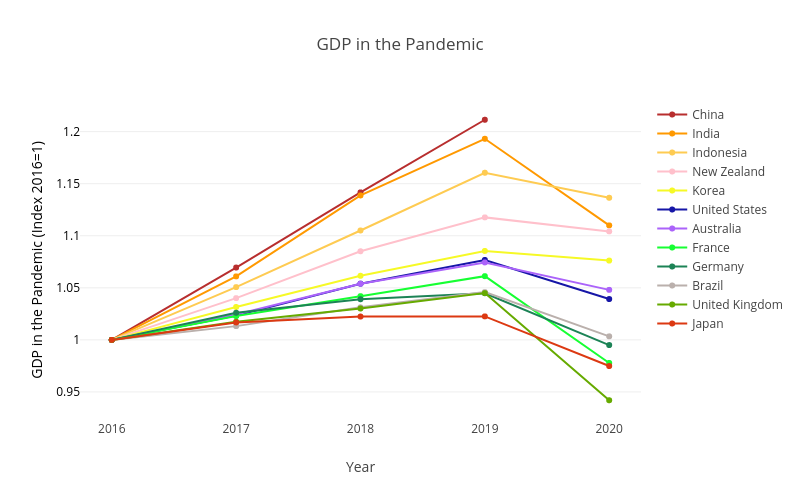
How big were the recessions? Europe experienced some of the deepest recessions with falls in annual Real GDP of -10.8% in Spain, -9.8% in the UK, -7.9% in France, and -4.8% in Germany. The US saw a fall of -3.5%. Australia and New Zealand saw falls of -2.5% and -1.2% respectively. Japan and South Korea saw falls of -4.7% and -0.8% respectively. Brazil’s GDP fell by -4.1%. India saw a fall of -7%, down from growth of 4.8% the previous year, and Indonesia saw -2% down from 5% the previous year. (China data is not yet available via OECD.) We will see later that these annual numbers hide much more dramatic falls and recovery that become visible when we look at quarterly GDP.
How should we think the Pandemic Recession? This question is important as how we understand the pandemic recession will have implications for what impacts different policies would have. So what kind of shock caused the Pandemic Recession? A Negative Supply shock? Or A Negative Demand shock? Restaurants give a good example of why this question is complicated in the Pandemic Recession. Did lockdown shut all restaurants, so it was a supply shock? Or did lockdown mean no-one went to restaurants, so it was a demand shock? Or maybe it was both a demand shock and a supply shock? Estimates for the USA from a sector-level model of labor demand and supply suggest that fall in hours worked was two-thirds due to supply shocks and one-third due to demand shocks.
A Supply shock that then generates a further Demand shock
Let’s take a close look at another possibility: a supply shock that then generates a further demand shock. Imagine a negative supply shock to ’half’ the economy; think of a lockdown that shuts the ’contact-intensive’ sectors such as restaurants, concerts, and tourism. All the workers in this half of the economy that suffer the negative supply shock stop consuming goods (stop buying things) as they have lost their income. This generates a large negative demand shock in the ’other half’ of the economy: think of the ’low-contact’ sectors like online shopping and streaming entertainment online. The result is that we get a big recession from a moderate initial negative supply shock.
The logic requires that the ’low-contact’ goods are not a good substitute for the ’contact-intensive’ goods. For example, pre-pandemic you both stream music online and go to concerts, while during the pandemic/lockdown you stop going to concerts but you do not compensate for this by spending all the money you used to spend on concerts on streaming music instead; streaming music is not a good substitute for live concerts. Similarly, Uber Eats is an poor substitute for Restaurants and visiting islands in Animal Crossing is a poor substitute for travel. Instead, you spend only a little bit more on ’low-contact’ goods than before, and you save a lot of money to spend on contact-intensive goods when they become reavailable. The resulting large increase in savings has been observed during 2020 with US$3 trillion of ’excess savings’ in US and Europe. Where ’excess savings’ is defined as savings in 2020 minus what savings would have been if the savings rate was the same as in the previous few years. (Savings rates were very high in 2020; forced or precautionary savings?). So to sum up the key assumptions underlying this ‘negative supply shock that then generates a further demand shock’ are that (i) there are ‘two’ sectors, of which the contact-intensive sector is hit by a negative supply shock, (ii) the low-contact sector output is a poor substitute for the contact-intensive sector output, and (iii) you expect these contact-intensive goods to become reavailable in near future. Note that the initial negative supply shock need not be lockdowns, could just be people voluntarily choosing to avoid other people for health reasons (strictly in terms of the logic the initial shock needn’t even be a supply shock, it could be a negative demand shock itself).
Toy Economy Example
To help make this ‘supply shock that then generates a further demand shock’ clearer let’s go through a Toy Economy Example to give the idea with some numbers. The model has Two People, Two Sectors, and Two Periods.
– Chris: works in a contact-intensive sector, e.g., a restaurant or hotel. Work involves a high level of personal interaction. Call this Sector C.
– Natalie: works in the not-contact-intensive sector, e.g., online retail or computer programming. Work involves little personal interaction. Call this Sector N.
Toy Economy in ’Normal’ Times:
– Chris works 10 hours in Sector C. Gets $10 wages.
– Natalie works 10 hours in Sector N. Gets $10 wages.
– Chris spends $5 on C goods (restaurants) and $5 on N goods (online shopping).
– Natalie spends $5 on C goods (restaurants) and $5 on N goods (online shopping).
– So GDP is $20.
You can calculate this as expenditure, production, or income. All give same answer of $20.
Also assume they each have assets/savings of $3.
Toy Economy in ’Pandemic’ Times:
– Negative supply shock shuts down Sector C (Lockdown the contact-intensive sector).
– Chris works 0 hours. Gets $0 wages.
– Chris spends all of his $3 of assets on sector N goods.
– Natalie used to spend half her income on sector C goods. She likes sector N goods but they are not a great substitute for sector C goods. Plus Natalie knows that sector C goods will become reavailable tomorrow (after lockdown/pandemic ends).
– So Natalie increases her spending on sector N goods to 2/3 of her income. Saving the rest so she can go to even more restaurants next year.
The result of this is
– Sector C contributes $0 to GDP. It is shut due to pandemic/lockdown.
– Sector N contributes $9 to GDP. (Natalies income is equal to output of Sector N. Spending in Sector N is 2/3rds Natalies income plus $3 from Chris. Spending in Sector N must equal output of Sector N. Notice this means Chris’ $3 must account for 1/3 of Sector N. So Sector N must be $9.)
– Also means Natalie earns $9, spends $6, saves $3.
– So Pandemic-time GDP is $9.
Toy Economy has a ‘Pandemic Recession’
– Pandemic-time GDP is $9.
– GDP fell by $11. (Recall, normal-time GDP was $20.)
– GDP has fallen by more than the direct $10 loss to lockdown!
– The initial negative supply shock (closing Sector C) has spillover negative demand impacts on the other sector (which remained open).
– In this toy example savings is unchanged (still zero as Chris dissaves $3 and Natalie saves $3). It is possible to add other things to model to get the ’excess savings’ seen in high-income countries.
Evaluating the ‘negative supply shock leads to a negative demand shock’ model
We now ask how realistic are the two main predictions of this explanation of the Pandemic Recession as a negative supply shock that leads to a negative demand shock. The model assumes a ’tomorrow’ when things return to normal. The model also assumes recession is concentrated in some sectors. Does the Pandemic Recession seem to fit this description?
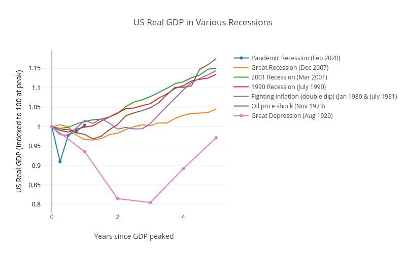
We start with the ‘tomorrow’ when things return to normal, at least for the economy. Figure 2 shows the falls in Real GDP for various recessions in the USA. You can very clearly see just how deep the initial quarter of the Pandemic Recession is in the US, and also how fast the economy recovers. This fits with the idea that there is a ‘tomorrow’ in which the ‘low-contact’ sector goods become reavailable.
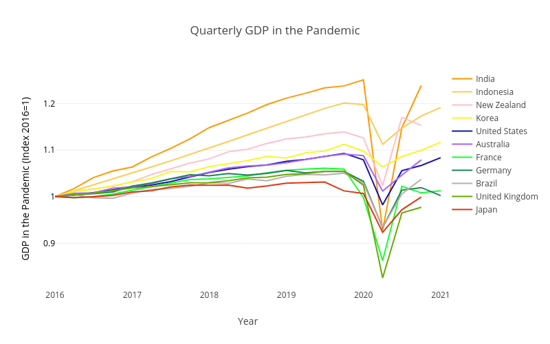
Another good way to see how ‘short and sharp’ the Pandemic Recession was is to look at quarterly Real GDP, as in Figure 3. We earlier saw the large falls in Annual Real GDP. Looking at the quarterly GDP falls we see that in fact almost all of the annual fall took place in the second quarter of 2020 (March-to-June), with many countries substantially, if not fully, recovered by the third quarter. The UK saw quarterly Real GDP fall by -19.5% in the second quarter, and then grew back by 17% in the third quarter; recall that it saw a fall in annual GDP of -9.8%. For Germany, France and Spain the second quarter saw falls of -9.7%, -13.2%, and -17.8% followed in the third quarter by growth of 8.7%, 18.5% and 17.1% (France had previously fallen 5.9% in the first quarter so this was not a full recovery to pre-pandemic levels). The US fell -9% followed by a 7.5% rebound, Australia fell 7% followed by a 3.5% rebound. Two countries that really highlight how sharp the Pandemic should be are India, where quarterly GDP fell by -25.9% in the second quarter, followed by a 23% rebound in the third, and New Zealand where a -9% fall in the second quarter was completely recovered with 14.1% growth in the third quarter to reach a higher level of quarterly GDP than pre-pandemic!
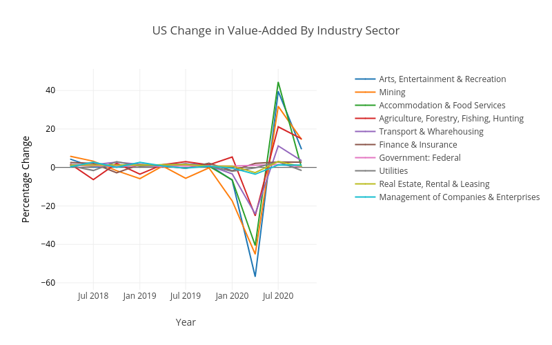
The other aspect of the idea of the Pandemic Recession as a negative supply shock that leads to a negative demand shock was the assumption that the recession is concentrated in some sectors. To try and think about this Figure 4 shows US GDP divided up among various sectors in terms of the sector value-added.
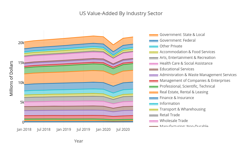
But while this does show the relative size of different sectors it is not easy to see whether some were more affected than others. Figure 5 therefore shows the percentage change in the sector value-added for the second quarter of 2020, for the five sectors with the largest falls and for the five sectors with the smallest falls. This certainly looks like our ‘half the economy is hit hard’ scenario! The Arts, Entertainment & Recreation sector falls by 57%! Mining falls 45% and Accommodation & Food Services falls 40%. On the other hand some sectors are largely untouched, with Utilities falling by 0.2%, while Federal Government and Finance & Insurance actually grow by 1.1% and 2.2%, respectively. When looking at Figure 5 it is worth remembering that if you decrease from 100 to 75 that is a 25% fall, and then increasing back to 100 would be a 33% increase (that is, the ’same’ increase will appear bigger). Here are links to two other versions of Figure 4 that do different degrees of breaking down the sectors: less, private/public. And also four links that present these same four graphs using ‘gross output’ rather than ‘value added’, so as to be closer to standard business concepts like revenue: level, percent change, less, private/public.
So our ‘negative supply shock that leads to a negative demand shock’ story about what happened to the economy during the Pandemic Recession looks plausible. It fits well with our observations that the recession was very deep, but also short; recall that the story required a ‘tomorrow’ in which the shut down sector returns. It also fits well with our observation that the recession was heavily concentrated in some sectors; recall that the story involved a negative supply shock to ‘half’ the economy, which then spills-over as a negative demand shock on the other half of the economy.
We now turn to looking at the Government response to the Pandemic Recession, starting with the Fiscal and Monetary responses, after which we will look at things like lockdowns, covid testing, and vaccination. Our ‘negative supply shock that leads to a negative demand shock’ will prove useful when we think about the likely impacts of the Fiscal response.
Part 3: Fiscal and Monetary responses to the Pandemic Recession
If you are lost here is a link to the first post in this series on the Pandemic Recession.
2 Comments
Comments are Disabled
Hi Rob,
I am not aware of a model that takes the covid-19 shock more seriously. It’s a shock to supply since producing certain goods require in-person contact in workplace. In cases of restaurant or alike, the shock is a both a demand shock and supply shock, or neither. Rather, it is really a shock to in-person marketplaces, which is necessary to model the impact of covid-19.
Great information on the sector GDP changes.
That ‘negative supply shock leads to a negative demand shock’ logic actually works equally well as a ‘negative demand shock leads to a negative demand shock’. Key is just that the initial shock shuts down one of the two sectors. I went with the initial shock as supply just because it makes it easier to talk about, realistically I think it is a complicated mix of demand and supply.
‘Contact sector C’ is trying to capture that in-person marketplaces aspect. It is not explicit in this simple model, but is there explicitly in the Economic SIR models in previous post, and in the Pandemic Possibility Frontier model (Kaplan, Moll & Violante paper) on next post. It is definitely core to understanding how different sectors of the economy were more impacted than others.