Posts By admin
The Pandemic Recession
As of writing in July 2021 global Covid-19 deaths are over 4 million out of a global population of 7.8 billion. We will here focus on the Economic aspects but before we do I just want to observe that this is an immense and tragic loss of life.
The first case of Covid-19 was detected in Wuhan, China during December 2019 and the virus spread rapidly around the world. Countries worldwide experienced their first wave of infections in the first half of 2020 and began imposing lockdowns and mandating the use of masks and social distancing in an attempt to save lives and slow the spread of the virus. Hospitals in Italy were among the first filled to overflowing, with hospitals in many other countries soon finding themselves similarly overwhelmed. The combination of people voluntarily reducing their interactions with others together with government mandated lockdowns brought many parts of the economy to a halt. Restaurants were closed, concerts cancelled, and even elective surgery was put on hold. The result threatened to be a massive loss of income for many people. In response governments stepped in with immense fiscal transfers, paying out large amounts of money in an attempt to keep firms from going bankrupt, keep people from being kicked out of homes due to being unable to pay their rent or mortgage, and simply to make sure that everyone could afford food to eat.
As we shall see both the sheer depth of the recession and the size of the government response were unprecedented. The Covid-19 Pandemic raises many interesting questions and here we will discuss a variety of Economic issues. The focus will be on a combination of what happened, and of trying to understand why it happened and the implications of this.
In this series of posts
- We will look empirically at what happened.
- We will try to understand the economic implications using theory.
- How should we think about the resulting recession?
- What are the economic impacts of lockdowns? How many lives do they save?
- What kind of fiscal and monetary actions were taken? What were their likely effects?
- Plus a bit of fun contemplating challenging moral and ethical questions.
The following link takes you to the first about the Economics of Pandemics as it stood Pre-Pandemic.
If you want to skip directly to the other posts:
Part 2: The Recession Itself
Part 3: Fiscal and Monetary
Part 4: Lockdowns &c.
Part 5: Post-Pandemic
Extra: References and Resources
The Pandemic Recession, part 1: Pre-Pandemic
We will look at the state of the ‘economics of pandemics’ prior to the Covid outbreak. This will include some theory about when to intervene to reduce infections while minimising disruption, some empirical work on how well interventions actually reduce the spread of infections, and some predictions about the kinds of recessions that pandemics are likely to cause.
The Economics of Viruses: Pre-pandemic Theory
Epidemiology –the study of the distribution/spread of illness in the population– mostly uses SIR models of virus spread. Lets briefly explain how these models work so that we can then understand what economics adds to these models. In a SIR model every person in the population is in one of three states: Susceptible, Infected, or Recovered. Depending on model setup there may be a fourth state, Dead. Susceptible people catch the virus and become Infected with some probability, 


Economic-SIR models add that people choose how much contact/socialising to do (socialising generates income or even just utility directly). The infection probability
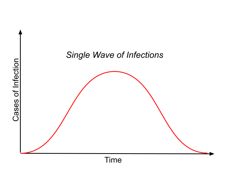
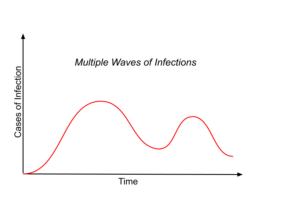
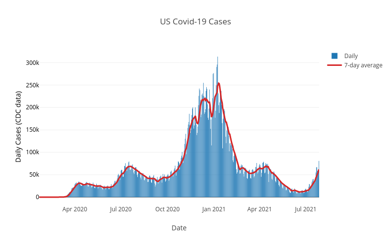
A standard SIR model produces a ‘single wave’, as shown in Figure 1A. An infected person is assumed to infect others at a constant rate and so the number of people catching the virus increases as the number of infected increase, making the curve get progressively steeper. Eventually most people are either recovered or dead and so the number of infected people falls and the curve flattens out towards the top and then proceeds to fall. Figure 1B shows an Economic-SIR model. The behavioral responses are needed to explain ’multiple waves of infection’. High levels of infections mean people take protective action (e.g., masks and social distancing) reducing the rate of infection and causing the peaks of the ‘waves’, as infections fall people relax and cease to take protective action, leading to the trough and a new wave begins. Figure 2 shows the infections for the USA and illustrates the multiple waves in infections which emphasizes the empirical relevance of these behavioral responses. The behavioral responses have important implications for spread of the virus, and also for understanding the role of any interventions to reduce the spread of the virus.
Now that we have a way to think about how viruses spread we turn to the question of when to intervene? What are the costs and benefits of early vs late intervention? Economic-SIR models have an negative externality (I use virus-protection to protect my own health, but I ignore that me not getting infected also reduces your probability of getting infected). This creates an efficiency motive for public intervention. Geoffard & Philipson (1996) and Sims, Finnoff & O’Regan (2016) look at the potential role of public interventions in stopping or slowing the spread of a virus. With certainty about the virus, early intervention is best as it is cheaper (avoiding contact, and hence infection, is costly and early intervention means smaller reductions in contact are required). With uncertainty —about, e.g., infectiousness, or death rate— there is an ’option value’: by waiting we find out information (resolve the uncertainty) which shows that the virus is infectious/deadly, in which case we do want to lockdown, or benign, in which case we do not want to lockdown. (Relies on the assumption there is a fixed-cost to intervention.) So in the real world we have competing motives for early vs late intervention. Once we understand how deadly a virus is and how quickly it spreads we are better off doing any intervention as early as possible. But when we don’t yet understand the virus we would like to wait for more information.
The Economics of Viruses: Pre-pandemic Empirics
One strand of pre-pandemic work focused on estimating impacts of interventions, e.g., school closures, on virus spread. A good example of this is Adda (2016) which uses weekly regional French data for influenza, gastroenteritis and chickenpox. It estimates the roles of school closure, transport shutdowns, and high-speed train networks in slowing/slowing/speeding the spread of virus. The opening of new high-speed train lines is found to increase the speed at which viruses spread to the newly connected regions. The case of school closures is very interesting. As expected school closures reduce the incidence of viruses among children who no longer pass them to one another in class. But surprisingly the school closures also increase the incidence of viruses…among grandparents! All the children spend their holidays visiting grandparents and taking their illnesses with them.
Another strand of pre-pandemic work aimed to answer the question: How big a recession would a pandemic cause? Two good examples are McKibbin & Sidorenko (2006) and Keogh-Brown, Wren-Lewis, Edmunds, Beutels & Smith (2010). Both model the pandemic as a shock to the economy (essentially a fall in employment and consumption) and evaluate the implication for GDP. The focus on the likely economic costs, not about evaluating different policy responses. Both suggest short/sharp recessions. A prediction that now looks prescient for the pandemic recession in 2020; we will discuss the short/sharp nature of this recession later. It is worth noting that most existing work estimating the recessions caused by pandemics was about either AIDS or SARS.
The Economics of Viruses: Past Pandemics
The Black Death in the 14th Century killed 50% of the population in England. This big fall in the labour supply resulted in higher wages and lower asset prices. But for the present pandemic even in US the death toll is well under 1% of the population. So we are not likely to see this effect in the Pandemic Recession. Plus most of the dead have been elderly and retired. The Spanish Flu of 1918 killed around 50 million in a global population of around 2 billion, so roughly 2.5% of population. In 2020 this would mean 195 million people, a number many times greater than the current death toll.
The Pandemic Recession, part 2: The Recession Itself
2020 saw a global recession as a result of the Covid-19 Pandemic, with especially large/deep recessions in a many countries. Let’s start with taking a look at some numbers. Then we will think about how we might understand the Pandemic Recession.
The pandemic began with the first known case of Covid-19 in China in December 2019. Covid-19 then spread rapidly with most countries experiencing their first wave during Feb-May 2020. Figure 1 below shows the falls in annual GDP during the Pandemic Recession that resulted. The timing of the recession in the US was roughly 2020Q2-2021:Q1. For Europe the recession began in 2020Q2 with the Eurozone entering a double-dip recession in early 2021, and expected to be growing by 2021Q3. Australia saw a recession in 2020:Q2-2020:Q3, and New Zealand saw just a single quarter 2020:Q2. Japan’s economy had already dipped by 2020:Q1 and saw a small fall relative to other countries, but also a slow recovery relative to other countries. China had a single quarter of recession in 2020:Q1 following which it returned to growth, but slower growth than usual. In India & Brazil the recession began in 2020:Q2 and remains ongoing. When looking at the experiences of different countries it is worth keeping in mind that Covid-19 has much higher death rates among the elderly (65+yrs old) and Europe has many more elderly as a fraction of the population. So Europe is more ’exposed/vulnerable’. Same for Japan.
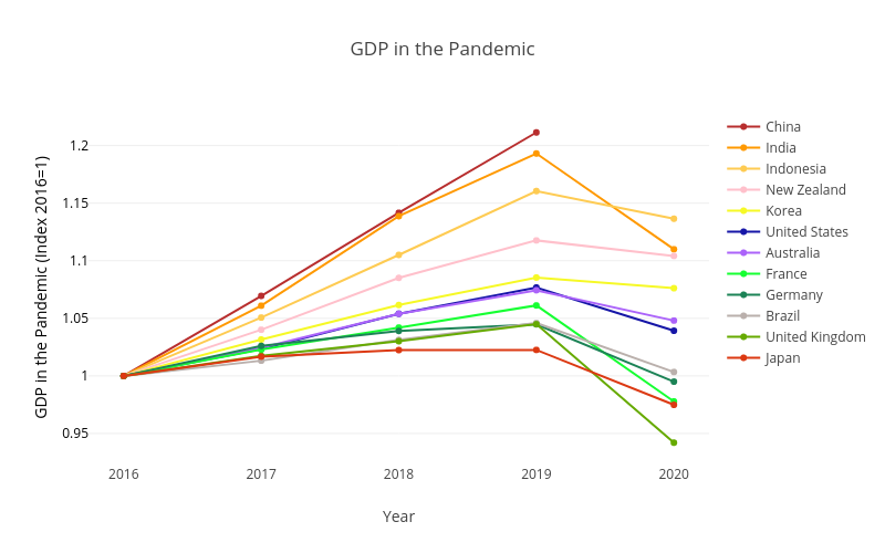
How big were the recessions? Europe experienced some of the deepest recessions with falls in annual Real GDP of -10.8% in Spain, -9.8% in the UK, -7.9% in France, and -4.8% in Germany. The US saw a fall of -3.5%. Australia and New Zealand saw falls of -2.5% and -1.2% respectively. Japan and South Korea saw falls of -4.7% and -0.8% respectively. Brazil’s GDP fell by -4.1%. India saw a fall of -7%, down from growth of 4.8% the previous year, and Indonesia saw -2% down from 5% the previous year. (China data is not yet available via OECD.) We will see later that these annual numbers hide much more dramatic falls and recovery that become visible when we look at quarterly GDP.
How should we think the Pandemic Recession? This question is important as how we understand the pandemic recession will have implications for what impacts different policies would have. So what kind of shock caused the Pandemic Recession? A Negative Supply shock? Or A Negative Demand shock? Restaurants give a good example of why this question is complicated in the Pandemic Recession. Did lockdown shut all restaurants, so it was a supply shock? Or did lockdown mean no-one went to restaurants, so it was a demand shock? Or maybe it was both a demand shock and a supply shock? Estimates for the USA from a sector-level model of labor demand and supply suggest that fall in hours worked was two-thirds due to supply shocks and one-third due to demand shocks.
A Supply shock that then generates a further Demand shock
Let’s take a close look at another possibility: a supply shock that then generates a further demand shock. Imagine a negative supply shock to ’half’ the economy; think of a lockdown that shuts the ’contact-intensive’ sectors such as restaurants, concerts, and tourism. All the workers in this half of the economy that suffer the negative supply shock stop consuming goods (stop buying things) as they have lost their income. This generates a large negative demand shock in the ’other half’ of the economy: think of the ’low-contact’ sectors like online shopping and streaming entertainment online. The result is that we get a big recession from a moderate initial negative supply shock.
The logic requires that the ’low-contact’ goods are not a good substitute for the ’contact-intensive’ goods. For example, pre-pandemic you both stream music online and go to concerts, while during the pandemic/lockdown you stop going to concerts but you do not compensate for this by spending all the money you used to spend on concerts on streaming music instead; streaming music is not a good substitute for live concerts. Similarly, Uber Eats is an poor substitute for Restaurants and visiting islands in Animal Crossing is a poor substitute for travel. Instead, you spend only a little bit more on ’low-contact’ goods than before, and you save a lot of money to spend on contact-intensive goods when they become reavailable. The resulting large increase in savings has been observed during 2020 with US$3 trillion of ’excess savings’ in US and Europe. Where ’excess savings’ is defined as savings in 2020 minus what savings would have been if the savings rate was the same as in the previous few years. (Savings rates were very high in 2020; forced or precautionary savings?). So to sum up the key assumptions underlying this ‘negative supply shock that then generates a further demand shock’ are that (i) there are ‘two’ sectors, of which the contact-intensive sector is hit by a negative supply shock, (ii) the low-contact sector output is a poor substitute for the contact-intensive sector output, and (iii) you expect these contact-intensive goods to become reavailable in near future. Note that the initial negative supply shock need not be lockdowns, could just be people voluntarily choosing to avoid other people for health reasons (strictly in terms of the logic the initial shock needn’t even be a supply shock, it could be a negative demand shock itself).
Toy Economy Example
To help make this ‘supply shock that then generates a further demand shock’ clearer let’s go through a Toy Economy Example to give the idea with some numbers. The model has Two People, Two Sectors, and Two Periods.
– Chris: works in a contact-intensive sector, e.g., a restaurant or hotel. Work involves a high level of personal interaction. Call this Sector C.
– Natalie: works in the not-contact-intensive sector, e.g., online retail or computer programming. Work involves little personal interaction. Call this Sector N.
Toy Economy in ’Normal’ Times:
– Chris works 10 hours in Sector C. Gets $10 wages.
– Natalie works 10 hours in Sector N. Gets $10 wages.
– Chris spends $5 on C goods (restaurants) and $5 on N goods (online shopping).
– Natalie spends $5 on C goods (restaurants) and $5 on N goods (online shopping).
– So GDP is $20.
You can calculate this as expenditure, production, or income. All give same answer of $20.
Also assume they each have assets/savings of $3.
Toy Economy in ’Pandemic’ Times:
– Negative supply shock shuts down Sector C (Lockdown the contact-intensive sector).
– Chris works 0 hours. Gets $0 wages.
– Chris spends all of his $3 of assets on sector N goods.
– Natalie used to spend half her income on sector C goods. She likes sector N goods but they are not a great substitute for sector C goods. Plus Natalie knows that sector C goods will become reavailable tomorrow (after lockdown/pandemic ends).
– So Natalie increases her spending on sector N goods to 2/3 of her income. Saving the rest so she can go to even more restaurants next year.
The result of this is
– Sector C contributes $0 to GDP. It is shut due to pandemic/lockdown.
– Sector N contributes $9 to GDP. (Natalies income is equal to output of Sector N. Spending in Sector N is 2/3rds Natalies income plus $3 from Chris. Spending in Sector N must equal output of Sector N. Notice this means Chris’ $3 must account for 1/3 of Sector N. So Sector N must be $9.)
– Also means Natalie earns $9, spends $6, saves $3.
– So Pandemic-time GDP is $9.
Toy Economy has a ‘Pandemic Recession’
– Pandemic-time GDP is $9.
– GDP fell by $11. (Recall, normal-time GDP was $20.)
– GDP has fallen by more than the direct $10 loss to lockdown!
– The initial negative supply shock (closing Sector C) has spillover negative demand impacts on the other sector (which remained open).
– In this toy example savings is unchanged (still zero as Chris dissaves $3 and Natalie saves $3). It is possible to add other things to model to get the ’excess savings’ seen in high-income countries.
Evaluating the ‘negative supply shock leads to a negative demand shock’ model
We now ask how realistic are the two main predictions of this explanation of the Pandemic Recession as a negative supply shock that leads to a negative demand shock. The model assumes a ’tomorrow’ when things return to normal. The model also assumes recession is concentrated in some sectors. Does the Pandemic Recession seem to fit this description?
We start with the ‘tomorrow’ when things return to normal, at least for the economy. Figure 2 shows the falls in Real GDP for various recessions in the USA. You can very clearly see just how deep the initial quarter of the Pandemic Recession is in the US, and also how fast the economy recovers. This fits with the idea that there is a ‘tomorrow’ in which the ‘low-contact’ sector goods become reavailable.
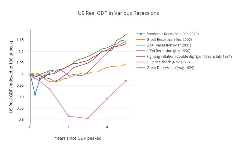
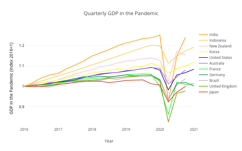
Another good way to see how ‘short and sharp’ the Pandemic Recession was is to look at quarterly Real GDP, as in Figure 3. We earlier saw the large falls in Annual Real GDP. Looking at the quarterly GDP falls we see that in fact almost all of the annual fall took place in the second quarter of 2020 (March-to-June), with many countries substantially, if not fully, recovered by the third quarter. The UK saw quarterly Real GDP fall by -19.5% in the second quarter, and then grew back by 17% in the third quarter; recall that it saw a fall in annual GDP of -9.8%. For Germany, France and Spain the second quarter saw falls of -9.7%, -13.2%, and -17.8% followed in the third quarter by growth of 8.7%, 18.5% and 17.1% (France had previously fallen 5.9% in the first quarter so this was not a full recovery to pre-pandemic levels). The US fell -9% followed by a 7.5% rebound, Australia fell 7% followed by a 3.5% rebound. Two countries that really highlight how sharp the Pandemic should be are India, where quarterly GDP fell by -25.9% in the second quarter, followed by a 23% rebound in the third, and New Zealand where a -9% fall in the second quarter was completely recovered with 14.1% growth in the third quarter to reach a higher level of quarterly GDP than pre-pandemic!
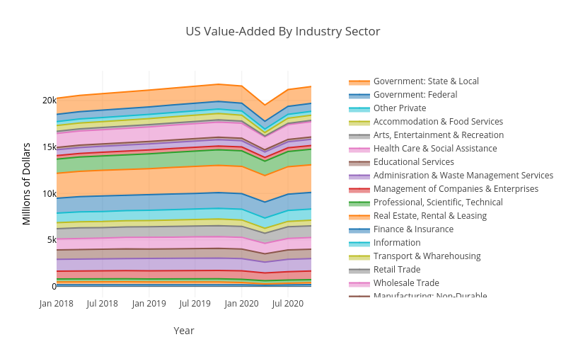
The other aspect of the idea of the Pandemic Recession as a negative supply shock that leads to a negative demand shock was the assumption that the recession is concentrated in some sectors. To try and think about this Figure 4 shows US GDP divided up among various sectors in terms of the sector value-added.
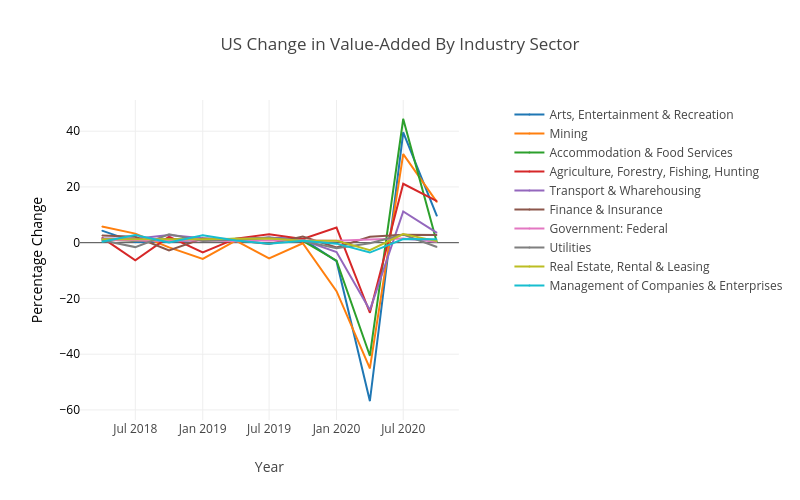
But while this does show the relative size of different sectors it is not easy to see whether some were more affected than others. Figure 5 therefore shows the percentage change in the sector value-added for the second quarter of 2020, for the five sectors with the largest falls and for the five sectors with the smallest falls. This certainly looks like our ‘half the economy is hit hard’ scenario! The Arts, Entertainment & Recreation sector falls by 57%! Mining falls 45% and Accommodation & Food Services falls 40%. On the other hand some sectors are largely untouched, with Utilities falling by 0.2%, while Federal Government and Finance & Insurance actually grow by 1.1% and 2.2%, respectively. When looking at Figure 5 it is worth remembering that if you decrease from 100 to 75 that is a 25% fall, and then increasing back to 100 would be a 33% increase (that is, the ’same’ increase will appear bigger). Here are links to two other versions of Figure 4 that do different degrees of breaking down the sectors: less, private/public. And also four links that present these same four graphs using ‘gross output’ rather than ‘value added’, so as to be closer to standard business concepts like revenue: level, percent change, less, private/public.
So our ‘negative supply shock that leads to a negative demand shock’ story about what happened to the economy during the Pandemic Recession looks plausible. It fits well with our observations that the recession was very deep, but also short; recall that the story required a ‘tomorrow’ in which the shut down sector returns. It also fits well with our observation that the recession was heavily concentrated in some sectors; recall that the story involved a negative supply shock to ‘half’ the economy, which then spills-over as a negative demand shock on the other half of the economy.
We now turn to looking at the Government response to the Pandemic Recession, starting with the Fiscal and Monetary responses, after which we will look at things like lockdowns, covid testing, and vaccination. Our ‘negative supply shock that leads to a negative demand shock’ will prove useful when we think about the likely impacts of the Fiscal response.
Part 3: Fiscal and Monetary responses to the Pandemic Recession
If you are lost here is a link to the first post in this series on the Pandemic Recession.
The Pandemic Recession, part 3: Fiscal and Monetary
How did governments respond to the Pandemic? We might think of all sorts of policy responses such as lockdown, travel restrictions, mask-wearing, vaccination, etc. Here we will focus on the Fiscal and Monetary responses, while the next post in this series looks at things like lockdown and covid tests.
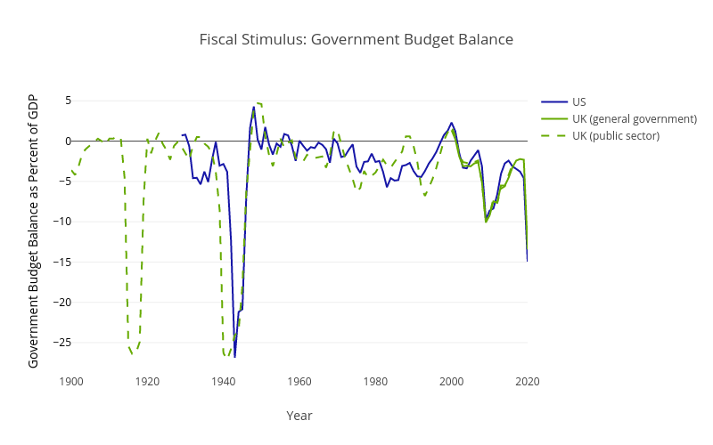
The first thing to observe about the fiscal stimulus response (government spending and tax cuts) is that it has been massive! Not just in terms of the number of dollars and Euros involved, but also historically. Figure 1 shows the size of the resulting fiscal budget deficits for the US and UK, both of which are they largest they have ever been in peacetime. A move into fiscal deficit occurs due to a combination of increased spending and decreased tax revenue, both of which represent fiscal stimulus.
What effect did this massive Fiscal stimulus have on the economy? Another way of asking this same question is how big was the fiscal multiplier?, that is, how big was the change in output divided by the change in government spending (and tax)? It is impossible to estimate the actual fiscal multiplier for any given recession (it can be and is estimated for recessions on average). But let’s use our two-sector model of a ‘negative supply shock that leads to a negative demand shock’ from the previous post to think about whether the Fiscal Multiplier is likely to be bigger or smaller than usual. We will begin with the relationship between the Fiscal Multiplier and the Marginal Propensity to Consume (MPC) that derives from the standard undergraduate Macroeconomic model of Aggregate Expenditure (a.k.a. the Keynesian Cross model). In the Aggregate Expenditure the Fiscal Multiplier=1/(1-MPC). Recall the logic for this result: $100 of spending is $100 of income for someone, who will then spend MPC, fraction of that, which is $MPC*100 of income for someone, who will then spend MPC fraction of that, etc., etc. (Remind me.) Our two-sector model of a ‘negative supply shock that leads to a negative demand shock’ predicts that the Fiscal Multiplier will be much smaller! We can follow the same logic as before to see why the Fiscal Multiplier will be small, based on the idea that the MPC is different in the two sectors. The MPC is high for those in the contact-intensive sector that got shut down as they lost all their income and so they would have to cut back on spending. Any extra income allows them to avoid this and so they will spend it, which is to say they will have a high MPC. The MPC is low for those in the non-contact sector as they have keep their jobs and so will smooth the consumption of any one-off additional income. These two MPCs together give a small Fiscal Multipliers as follows: Give Fiscal Transfer of $100 to those in closed contact-intensive sector. Their (very high) MPC was one (in toy example), so they spend $100, but all this goes as income to those in the not-contact-intensive sector who still have their jobs and have lower MPC (was 0.66 in toy example). All the further rounds are based on this lower MPC. So our Fiscal Multiplier is now mostly based on the lower MPC. So the Fiscal Multiplier is smaller. (To be precise the Fiscal Multiplier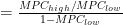


On the one hand, a low fiscal multiplier suggests that fiscal stimulus is not as worthwhile as it normally would be. But it is important to note that much of the fiscal policy during the Pandemic Recession was more deliberately redistributional, with a goal of helping those who lost all their income due to government-mandated lockdowns, than it was necessarily about stimulating the aggregate economy. This leads us to another important observation about Fiscal policy during the Pandemic Recession.
The Political Economy of transfers has been very different in the Pandemic Recession. Transfers to those sectors most impacted in a recession normally raise concerns about moral hazard. For example bailouts to bankers during the 2007-9 Financial Crisis and the ensuing Great Recession raised huge concerns about moral hazard. Moral hazard is the concern that bankers, knowing they will be bailed out, deliberately take even bigger risks thereby making financial crises more likely. (Also seen as rewarding them for their past indiscretions.) By contrast there has been little worry that transfers to waiters whose restaurants were shut during Pandemic will create moral hazard. There is a widespread view that those hit hardest by the pandemic are not responsible for finding themselves in that position and so should not be blamed for it. There is no apparent concern that transfers will make people more likely to work in pandemic-exposed sectors in the future. So while smaller Fiscal Multipliers might argue for less Fiscal Stimulus, a major constraint on Fiscal Stimulus is normally moral hazard concerns and bailing out those ‘responsible’ for the recession which have been largely absent during the Pandemic Recession and perhaps helps explain why the fiscal responses are huge by historical standards.
Enough about the general concepts of Fiscal policy. What kinds Fiscal Policy actions have been taken? High-income countries did two main kinds of policies: (1) Subsidised/cheap loans to business, and (2) Income transfers to individuals. Evidence from the UK suggests that the subsidised/cheap loans to business did succeed in the goal of rescuing normally profitable firms that might not have survived lockdowns, but that it may also have keep alive a few weaker firms that would have failed in normal times. We will focus here on a specific aspect of the income transfers, namely that in the US they were mostly in the form of direct-transfers of money and unemployment benefits, while in other countries they were mostly in the form of transfers via employers. These programs which paid employees who would otherwise see their hours reduced or be fired are called ‘short-work’ programs (from the German Kurzarbeit). Roughly speaking short-work programs involve the Government transferring money to employers on the condition that these firms continue to keep employing the worker on, e.g., half the hours and paying half the wage while the Government pays the other half of the wage. This difference between how the Government made income transfers had a huge impact on employment rates. In Figure 2 you can very clearly see how much bigger the US employment fall was. And how little employment fell, particularly in Europe which made widespread use of short-work programs, especially given how deep the recession was. Unemployment showed the ‘opposite’, a spike in the US but not other high-income countries. Emerging economies typically do not have the combination of money and administrative capability for short-work programs and so saw falling employment.
So short-work programs clearly prevented employment rates from falling. But are they a good idea? Short-work programs subsidize ’labor hoarding’, where firms continue to employ workers that are not currently needed but may be needed in the future. This could be efficient if there is firm-specific human capital and liquidity-constraints on firms, or if there are costs to hiring/firing plus some kind of negative externality from job search, and if the post-pandemic economy involves workers in the same sectors as before. Will be inefficient if the post-pandemic economy needs the workers to be in different sectors than before (as delays the needed restructuring). Negative externalities of job-search are standard in ’search-and-matching’ models: when you are searching for a job your probability of getting a job is decreased when other people are also searching for a job; a ‘congestion’ externality. To put it another way, for short-work programs to be efficient there needs to be a reason ’labor hoarding’ is a good idea, but also a reason why firms can’t/won’t just do so themselves.
Germany has long had ’Kurzarbeit’: a firm facing revenue loss can apply for a time-limited short-work subsidy (the firm pays workers part-time wage for part-time work, government tops this up to the full-time wage). These programs have become increasingly popular in Europe. Estimates for Germany indicate that 2.35 million employees (almost 6% of total employment) will receive Kurzarbeit during the COVID-19 crisis, compared to 1.4 million at the peak of the Great Recession. In France, 730,000 employees (2.8%) are currently being paid by the French short-time work scheme. In Belgium, 100,000 people were on short-time work at the peak of the Great Recession, while during Pandemic 1 million are (22%). The Pandemic saw short-work programs implemented for the first time in Australia, New Zealand & UK. Australia called theirs JobKeeper and it payed wages of employees. Initially for all, and then after initial round ended the program was modified to allow only employers who were losing money due to covid-19 to get JobKeeper for their employees. In New Zealand it was called Wage Subsidy and paid wages of employees and self-employed. Any firm that had a 40% decline in revenue due to lockdown was eligible and it has been repeated during each lockdown. The UK called theirs Furlough and paid the wages of employees for hours they cannot work due to lockdowns. Furlough applies across the UK and covers up to 80% of an employee’s salary for the hours they can’t work, up to a maximum of £2,500 per month.
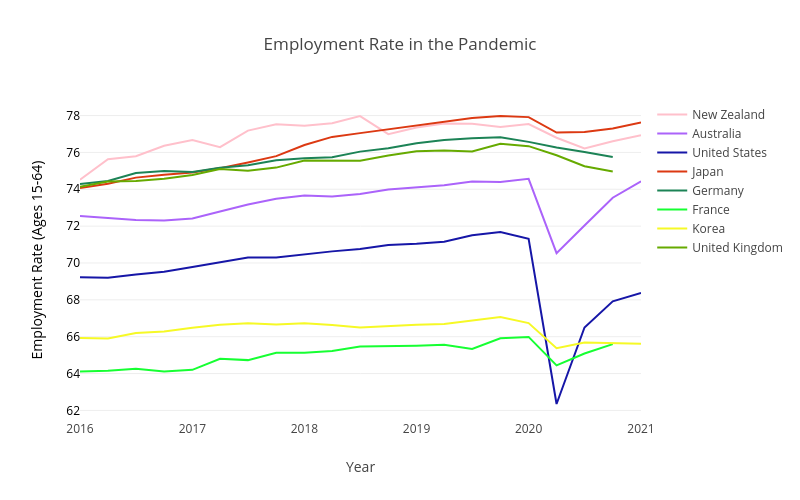
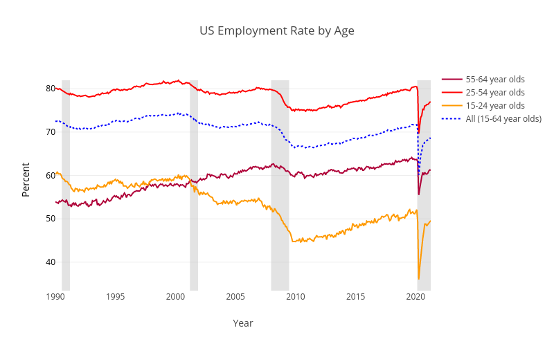
While looking at employment let’s take the opportunity to consider some gender and age aspects of the recession. We can see employment rates by gender for the US in Figure 3. As can be seen both males and females suffered large job loss during the recession and quickly recovered most of the loss afterwards. There is not much difference by gender, although most countries saw female employment fall slightly more in the recession (due to working in more contact-intensive sectors; Furman, Kearney & Powell, 2021), but then also recover faster/higher afterwards. This is notable mostly because it is the opposite of most recessions, where male employment falls more (Albanesi & Kim, 2021). This does not mean that there are no concerns about different impacts of the recession on men and women. Simply that these have tended to focus much more on that with children at home (schools closed) there was imbalance in terms of workload with women expected to do more of the ’extra’ childcare. For those interested here are graphs of employment rates by gender for Australia, Germany, Japan, New Zealand, and the UK.
Employment rates by age for the US are shown in Figure 4. The elderly were hit much harder than usual in this recession. The young were hit hardest, but this is standard in recessions and not specific to the Pandemic Recession. Note in the graph that the initial fall for young is bigger, but overall fall for elderly is much larger than usual. In previous recessions employment of older people hardly falls, but in pandemic recession it has fallen by similar magnitudes to young. Most countries see unusually large employment losses for older workers. One way this has manifested in the US is with a jump in retirement, which has otherwise trended downward in recent decades. For those interested here are graphs of employment rates by age for Australia, Germany, Japan, New Zealand, and the UK.
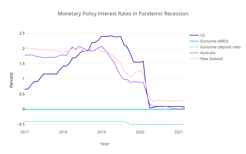
We turn now to Monetary Policy and it’s reaction to the Pandemic Recession. Unsurprisingly the first thing Central Banks did was to rapidly cut interest rates to zero, except in the Eurozone where the rate was already at zero. Figure 5 shows these cuts in interest rates. The European Central Bank (ECB) has a main rate (called MRO) which remained at zero and also a secondary ‘deposit rate’ which can be negative.
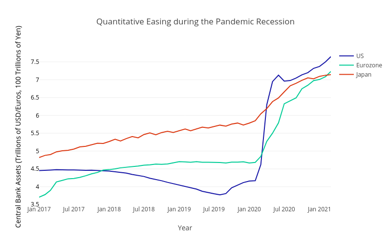
Having run into the zero lower bound, Central Banks quickly turned to Quantitative Easing (QE). Quantitative Easing involves the Central Bank buying assets (e.g., 10 year government bonds, or corporate debt, or mortgages; details differ by country and time). So in Figure 6 we can see QE as an increase in Central Bank Assets. To get an idea of the size —how much is a trillion dollars?— it helps to think about things as a percentage of GDP. The increase in the second quarter of 2020 is 15 percentage of GDP for the US, 13 for the Eurozone, and 18 for Japan (graph).
By early March 2020 many corporations and households were desperately selling assets to raise cash to cover immediate needs. Normally during a crisis US Treasuries see interest rates fall due to increased buying in a ’flight to safety’ and this occurred in Feb 2020. But in early-mid March interest rates on 10-year US Treasuries began to jump up due to rampant selling (graph). US Treasuries is considered one of the most liquid markets in the world and the breakdown of Treasury market was bigger than during Great Financial Crisis (GFC) of 2007-09 which saw massive flight-to-safety into US Treasuries, but never big selling out of US Treasuries. (Flight-to-safety: people sell risky assets, like shares, and buy safe assets, like US Treasuries.) The US Federal Reserve held an emergency meeting on Sunday 15th March and decided to buy $500bn of US Treasuries plus $200bn of mortgage-backed debt. One week later it had already increased this to ’unlimited’, to put it mildly this was a large Quantitative Easing program and as evident from earlier graph they ended up spending around $3trn by mid-2020.
Australia and New Zealand, which had not needed QE during Great Recession, both embarked on QE in response to the Pandemic Recession. Large-Scale Asset Purchases (LSAP) in New Zealand saw the Reserve Bank of New Zealand authorised to buy up to NZ$100bn of Government bonds (national and local). As of June 2021 RBNZ had bought NZ$57bn. In Australia the Reserve Bank of Australia purchased AU$200bn. Interestingly the QE of Australia and New Zealand was not your Grandfather’s QE (your Grandfather in this case being the Great Recession of 2007-09). The original motivation of QE during the Great Recession was to bypass banks in getting money/credit to firms and households. During the GFC the US first tried buying all the distressed assets from banks (TARP), but the banks just kept all the money from this, typically as reserves at Central Bank, instead of lending it to the broader economy. In response the US embarked on it’s first QE program as a way to buy assets (debt assets) directly from the market, bypassing the banks. During the Pandemic Recession this remained true for the US where the Federal Reserve also bought mortgage-backed debt, bailed out money-market funds (again), and even corporate debt. But it is not true in Australia and New Zealand where the Central Banks only purchased government debt since the Government Bonds were mostly purchased from Banks, so their QE mostly works via banks.
Alongside the asset purchases of QE many central banks went much further in providing credit for all. The US Federal Reserve directly purchased corporate debt, made long-term loans directly to banks, and helped mid-size firms secure loans. Essentially, the financial system broke down, but because Central Banks stepped in with so much lending people ended up still able to access credit just fine. In many cases the Central Bank has massively expanded credit to banks which have in turn expanded credit to firms and households. Another policy many Governments instituted in relation to providing credit was a temporary freeze on mortgage payments, which massively reduced households need for credit to cover their regular expenses. The US did, as did Australia which had 850,000 mortgages deferring payments, but by early 2021 the program ended and there were just sub-5000 still deferring.
Enough of Fiscal and Monetary, in the next post we look at lockdowns and other related aspects of the response to Covid-19.
If you are lost here is a link to the first post in this series on the Pandemic Recession.
Here is a brief list of the main fiscal policies enacted in each of the USA, Australia, and New Zealand:
Fiscal Policy in USA included:
– First stimulus (March 2020): $2.2trn.
$1,200 to individuals earning up to $75,000, with smaller payments to those with incomes of up to $99,000 and
an additional $500 per child. Increased unemployment benefits by $600 per week. $377 billion in federally
guaranteed loans to small businesses and $500 billion government lending program for distressed companies.
– Second stimulus (March 2021): $1.9trn.
$1400 checks to everyone, jobless aid of $300 a week, and aid for states, cities, schools and small businesses.
There are also an Infrastructure plan and a Families plan that sum to $4trn.
These are the main programs by cost. Both stimulus bills also included billions for hospitals, vaccination, and the like.
Fiscal Policy in Australia included:
– Allowing people to make withdrawals from superannuation funds.
Normally only possible at retirement.
– JobKeeper: payed wages (a short-work program).
Initially for all, then after initial round ended the program was extended for employers who were losing money due to covid-19 to get JobKeeper for their employees.
– Income stimulus payments.
Penioners, Families & Carers got two payments of $750 each and another two of $250 each.
– Coronavirus supplement.
Roughly, anyone receiving benefits got an extra $250 per fortnight.
These are the main programs by cost.
Fiscal Policy in New Zealand included:
– Wage Subsidy Scheme: loosely, paid wages of employees and self-employed.
Any firm that had a 40% decline in revenue due to lockdown was eligible. Has been repeated during each
lockdown.
– COVID Income Relief Payment: $490 per week for 12 weeks for those who lost jobs.
– Small Business Cashflow Scheme: cheap loans to small businesses that lost 30% of revenue.
No interest if repaid within 2 years. Otherwise 3% interest.
These are the main programs by cost.
The Pandemic Recession, part 4: Lockdowns &c.
Let’s turn to perhaps the most controversial response of Governments to the Covid-19 pandemic: Lockdowns. We will begin with the thought that lockdowns save lives but have economic costs. Can we draw the Pandemic-Possibility-Frontier associated with different severities of lockdown?
Figure 1 does exactly this for the US, each point on the solid blue line in the figure represents a different duration of lockdown, with the horizontal axis showing the loss of life associated with this duration of lockdown, and the vertical axis showing the loss of income. So the top left is long lockdowns that cause large income loss, but little loss of life, and the bottom right corner is no lockdown which results is little loss of income but large losses of life. The flat part on right is when ICU reaches maximum capacity and deaths spike (ICU is Intensive Care Unit, in Hospital). The flat part on the left is when lockdown is severe enough to get people vaccinated before a second wave of virus. The underlying model assumes a vaccine will arrive after 18 months, and that number of ICU beds is fixed/limited. The blue line also assumes that the US Government provides the same fiscal support as it did in practice. The orange line represents the same lockdowns, but now without the fiscal support with which the lockdowns in the US were combined in practice. The model also estimates different costs for different people: putting them in order from least economically impacted to most economically impacted we can draw the 10th and 90th percentiles, these are the lower and upper edges of the colored regions. E.g., with US policy (lockdown plus fiscal support) the average economic loss is 3 months income, but 10% of people experience less than 1 month income loss and 10% of people experience more than 4.5 months income loss (roughly).
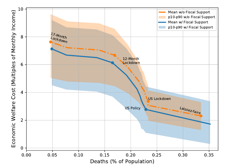
The model used by Kaplam, Moll & Violante (2020) that underlies this Pandemic Possibility Frontier combines a SIR model with a heterogenous agent economic model. SIR is the standard epidemiological model of how a virus spreads and was discussed in the first post of this series. A heterogenous-agent incomplete market model is a standard macroeconomic model of the economy which contains many different people. Model allows for the fact that some people work in occupations that are more contact-intensive, and that some consumption goods (e.g., concerts) are more contact-intensive. More contact-intensive work and consumption increases spread of virus. People in the model decide how much risk of catching the virus they will expose themselves to on the following logic: I choose to avoid contact-intensive activites to minimize my own personal health risks, but I do not take into account the additional health benefits to others of me not getting sick meaning others are less likely to get sick too (as they then cannot catch virus from me). As a result the model has negative health externalities mean if we asked the model which policy was ’pareto optimal’ it would prefer some lockdown. Note however that model was not asked which policy was the pareto optimal, instead it was used to draw the trade-offs as captured by the Pandemic Possibility Frontier, which is mathematically the same concept familiar to Economics in the form of the Production Possibility Frontier when thinking about firms. They find that those most economically exposed to virus are also the most financially exposed in the sense that the loss of income will lead to reduced consumption as they have few assets and little ability to borrow. That is, those who lose the most income are the people with high MPC. The most economically exposed are people who work in contact-intensive occupations which are ’rigid’ in sense there is no decent online/remote alternative. This is based on data, not the model. The model helps spell out the macroeconomic implications of this finding. Another finding based on data and not the model is that the biggest economic losses of US lockdown were for middle incomes. Low income households lost the most in job earnings, but fiscal policy was generous enough to more than fully make up for their losses, so much so that the US poverty rate was almost cut in half. Middle income households lost a smaller share of income, but fiscal policy only partly makes up for their losses. High income households typically kept working so did not experience much income loss.
What about other Government policies like covid tests, self-isolation/quarantining, mask mandates, and contact tracing? Masks and Social Distancing are ‘non-pharmaceutical’ interventions. Absent development of pharmaceutical interventions they simply delay the pandemic. No vaccine was ever developed for the 1918 Spanish flu pandemic. Testing and Quarantining are pharmaceutical interventions that once developed allows a partial economic reopening without further loss of life. Are also useful if reinfection if possible (e.g., due to virus mutations). Same thing for tracing although the privacy implications make this more onerous. Economic models similar to those described predict that effective tests combined with (perfectly enforced) self-isolation/quarantining can massively reduce both deaths and economic losses (Eichenbaum, Rebelo & Trabant, 2020). Better medical treatment for those who do fall ill with the virus also improves the trade-offs by allowing some combination of partial reopening and less loss of life. The death rate among infected has fallen since beginning of Covid-19 pandemic as medicine better understands how to treat those infected (drugs, assisted breathing equipment, etc.). All of these can be understood as other ways to shift the pandemic possibility frontier down/left. If you want a detailed idea of what policies various countries took here is a link to a variety of indexes measuring the ‘Policy Responses to the Coronavirus Pandemic‘, with lockdowns being the ‘Government Stringency Index’.
Let’s return to Lockdown which clearly saves lives, but what about the economic impacts? Evidence suggests short & sharp lockdown offers better trade-offs in terms of the economy and human life. Short & sharp lockdown allows the economy to then be reopened sooner. The large short term loss of output is more than offset by the longer term improvement in output. (Arias, Fernandez-Villaverde, Rubio-Ramirez & Shin, 2021; estimation based on Belgium.) Note in this context that the Pandemic Possibility Frontier seen earlier comes from a study that considers lockdown and no-lockdown, as well as the duration, but not the intensity of the lockdown. Hence it had nothing to say about this issue. So strict lockdown is good for the economy…
…in high-income countries. In low-income countries, such as India, lockdown appears to have saved fewer lives and not saved the economy. If you live in a slum in Mumbai (1 million people in 2 sq kms) during a lockdown are you really isolating your household? More importantly lockdown in poor countries means starvation. In high-income countries everyone has a bank account and governments made electronic money transfers which people could use to buy food from supermarket. In low-income countries many do not have bank account nor are there the distribution networks underlying supermarkets. Nor do the poor have any savings. If they don’t work that week they don’t eat that week. When India locked down poor people fled cities, where they would have starved, to their villages. Spreading covid from the cities to the rest of the country. This happened again in India’s second wave. In a low-income country like India covid-19 is far from the only disease causing death: in 2017 more than 3000 Indians died per day from tuberculosis or diarrhea. The economic loses have been massive and tragic. India’s middle class ($10-20 per day) shrunk by one-third, with 32 million people falling into poverty. After two decades of rapidly falling Global Poverty, 2020 saw the first rise in global poverty since 1998. Prior to Covid-19 it had been widely predicted that the end of extreme poverty (<$4 per day) was approaching. The next few years will see if this setback is temporary or permanent, let us sincerely hope it is temporary.
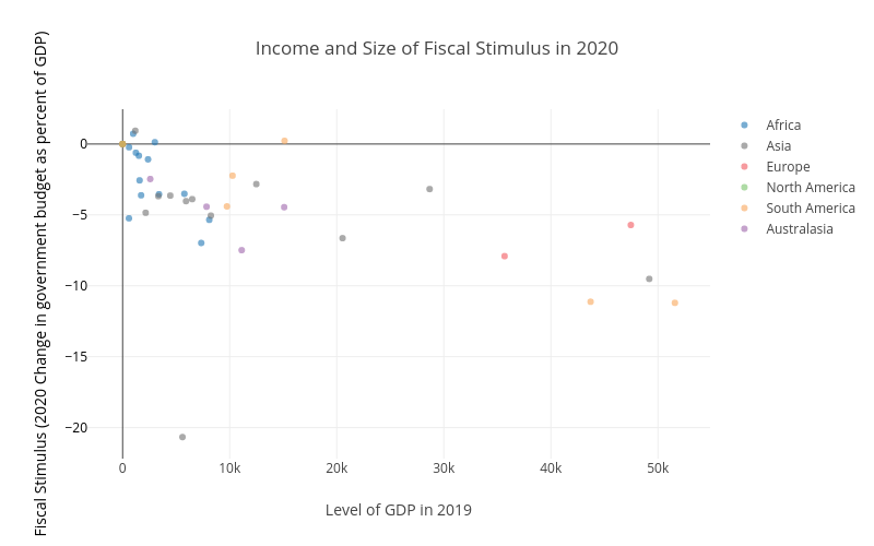
Figure 2 shows the ‘difficulty’ low-income countries have faced in deploying the kind of large fiscal support seen in high-income countries. On the right are the high-income countries, and being lower on the vertical axis shows that they have done large fiscal stimulus. By contrast the low-income countries on the left are higher up as they have had much smaller fiscal stimulus. This partly reflects different administrative capabilities, with high-income countries better able to coordinate and execute large increases in spending. But mostly it reflects that the ability to engage in large fiscal stimulus depends on being able to borrow the necessary money. High income countries have larger tax revenues (so better ability to repay the debt). High income countries have the financial infrastructure needed to borrow and transfer/spend large amounts of money quickly. High income countries also have more stable government, so are more trusted to repay debt in the future. Economists often refer to ‘fiscal space’ to describe the room to borrow of countries.
Many low and middle income countries have seen increases in hunger and poverty (Brazil, Argentina). School-closures in high-income countries meant online-education (an imperfect replacement). In low-income countries it meant no school. This led to an increase in children working in developing countries. Low and middle income countries tend to be younger (fraction of population aged over 65, and hence most vulnerable to covid-19, is smaller). So ceteris paribus should have been less affected. Of course in practice not everything else is equal.
I personally have wondered if Asia may not be less affected, ceteris paribus, due to genetic resistance to the family of viruses to which Covid-19 belongs, given that the virus originated in China? There is evidence of a coronavirus 20,000 years ago that left a mark in the DNA of many people in East Asia. The idea being much like how smallpox which was moderately deadly among Europeans, devastated the inhabitants of the Americas when it came over with the Europeans shortly after Columbus. Having lived with smallpox for centuries Europeans were less susceptible. Smallpox is thought to be an important part of why after Cortés first took over the Aztec empire his small group of Spaniards and their Indian allies they were able to hold it, with smallpox killing 50% of the population. There is also one documented incident of smallpox-laden blankets being deliberately given to Shawnee and Mingo native americans in the USA in an attempt to kill them; the US military is documented as wanting and planning to do so, but there is no documented evidence that they followed through and did so. Note that the present paragraph is pure speculation on my part, I am not aware of evidence that people of East Asian origins are less vulnerable to Covid-19.
Obviously the most important thing for finally dealing with a pandemic is vaccination. It largely ends the deaths at little to no economic cost. Doses of the main Covid-19 vaccines cost only around $20 each. (You need two doses of most vaccines.) Even after paying for all the additional distribution and administration costs of vaccination, hundreds of dollars per dose, this is vanishingly small compared to the costs of lockdowns and social distancing. Not to mention vanishingly small compared to the value of a human life. The pace at which this can be done (safely) is key. In practice, as well as the issue of safety, there is the challenge of ramping up production quickly. Offering large prizes is thought to be a very cost effective way to encourage innovation and countries did this to encourage vaccine development (e.g. US Operation Warp Speed). Vaccination eliminated smallpox in 1979 after centuries of deaths (300 million deaths in 20th century alone). The key was not just developing the vaccine but making it easy, cheap, and widely available as part of a major public health campaign.
Let’s look at two more aspects of the Pandemic Recession. What happened to asset prices, and the moral questions raised.
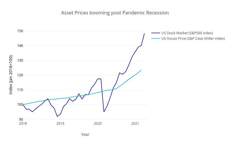
Stock markets and house prices have risen massively, with the US experience shown in Figure 3. While the stock market experiences a big fall early in 2020 this quickly turned around and by late 2020 was well into a boom. There are a few main explanations for this which we will now look at in turn. Part of the rise in asset price reflects lower interest rates. The role of low interest rates in high asset prices can be understood in terms of present value. The ’Present Discounted Value’ of $100 next year is $100/(1+r) now, where r is the interest rate. When interest rate r decreases the same ’future value’ becomes a larger present discounted value. Stocks and houses are assets you buy today that pay out in the future as dividends and rent, respectively. So the price of these assets will increase when the interest rate decreases (ignoring for simplicity any changes in future dividends and rent, which may also have been influenced by the pandemic). Another part of the rise in asset prices reflects the ’excess savings’. It is estimated that $170 billion from the second US stimulus would flow into the stock market. Small investors normally account for 10% of trading in US, they are estimated to be 25% during pandemic. Essentially all the excess savings being invested in the same existing assets means higher asset prices. Another part of it will likely turn out to be a bubble. I here use ’bubble’ to describe a steep price rise followed by sharp price fall, not necessarily in a pejorative sense.
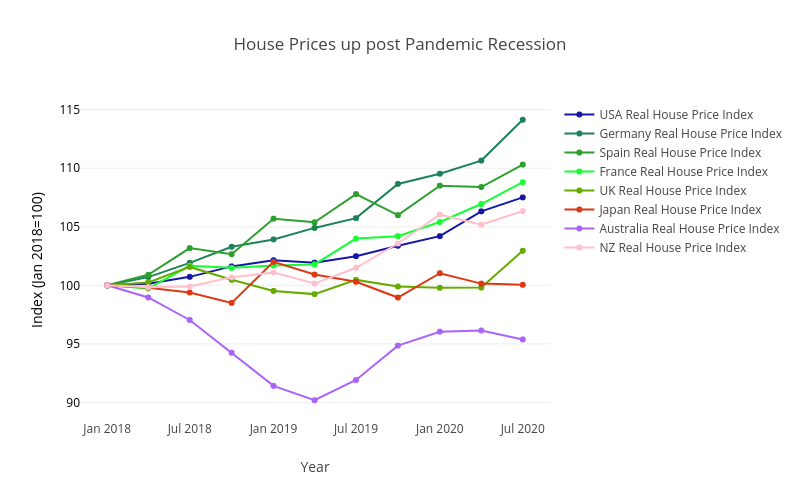
This is not just true of the US. Figure 4 shows that these increased house prices are widespread among high-income countries. As well as more demand for housing there has also been a change in kind of houses people want to buy. Less inner-city apartments, more single-home in mid-size cities or suburbs. More ’home office’ space. On the other hand there has been a major fall in occupancy rates for commercial office space.
The Pandemic has highlighted the important role of ethical and moral judgements in the decisions we make as society and as individuals. Is it ethical for airlines to require proof of vaccination before letting you board an airplane? What about your employer requiring proof of vaccination before letting you come to work? Or your employer requiring a negative covid test? Note that some employers already require, e.g., negative tests for drug use such as THC (marijuana). Examples as of mid 2021 include that France and Italy now require vaccination (or negative tests) to go to Restaurants. All public employees in California must be vaccinated or have weekly tests. More generally any decision on how much we should try to reduce deaths from Covid-19 versus avoiding lost income, lost jobs, family seperation, loneliness and mental health, lost education (test-based evidence shows students learn less with remote teaching), etc., clearly involves important moral judgments and personal opinions of what is important in life.
The final post in this series looks Post-Pandemic.
If you are lost here is a link to the first post in this series on the Pandemic Recession.
The Pandemic Recession, part 5: Post-Pandemic
Economies are fast making a full recovery at the aggregate level: with GDP rapidly back to or even above pre-pandemic levels, and employment recovering fast. But consumption patterns look very different: spending is up massively on sport & recreation goods, on cars, houses and home improvements, and on tech and online shopping. Spending remains lower on travel, food and accommodation. Are these changes in consumption permanent, or will they soon pass?
A personal favorite anecdote of consumption changes during the pandemic lockdowns involves eggs. When people go to the supermarket they prefer to buy free-range eggs, or at least barn eggs. In contrast when they go to restaurants or get take-away the eggs being served are typically barn eggs or caged eggs. In short, when you buy eggs you care more about the chickens, when the restaurant buys eggs for you they care more about the price. Lockdown meant no more restaurants and people were instead buying all their eggs from supermarkets. The result was a sudden shift in demand away from barn and cage eggs towards barn and free-range eggs (there is a longer-term trend in the same direction for both supermarkets and restaurants).
Related to both the shifting consumption patterns and also to shifting employment conditions there has been a spike in inflation. Historical pandemics have not been associated with inflation (quick general caution, most work on what happens after historical pandemics identifies them by their death tolls which are typically much larger than the present Covid-19 pandemic). This suggest that the inflation spike as of mid-2021 will be transitory, although obviously this will also depend on how monetary authorities react.
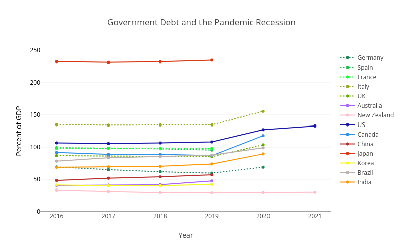
One important future challenge is that once the pandemic recessions are over countries will find themselves with higher levels of Government debt. Figure 1 shows how Government debt (as a percentage of GDP) increased substantially during 2020 for many countries. In 2020 UK Government debt increased by 18%-of-GDP, the US by 19%, India by 16%, Canada by 31%, and Italy by 21%.
This increased Government debt has likely reduced the fiscal space of many countries for reacting to future recessions and crises. It will also accelerate difficult decisions that many countries face around ageing which will drive increased future pension obligations (more retirees) while taxes to pay for them will not grow nearly as much (less working age people as fraction of population). Reduced pensions, increased taxes, working longer? None of the solutions will be easy. Reducing Government debt is likely to have important economic impacts over the coming decade: Fiscal austerity?, Financial Repression?, Inflation?, Government Debt Crises? Loosely related, in the 1980/90s there was substantial forgiveness of debt owed by low-income countries that had been lent to them by high-income countries during the previous decades on grounds they could not repay; think Live 8 concerts. Something similar may be replaying right now with China as lender via Belt-and-Road Initiative (e.g., Sri Lanka). Note that heavily-indebted poor countries unable to repay was not the aim of the earlier lending, nor of China’s current lending, but it was the result.
Let’s wrap this up with a few final thoughts. Much of this discussion and related evidence depends on the nature of the Covid-19 pandemic. It disproportionately kills the elderly (65+ years old) who are mostly non-working. It is not deadly enough to younger people to kill a large fraction of the working population. By contrast in 1918 the Spanish flu mostly killed people aged 20-30 years old. Substantial amounts of work can be done online without personal contact (in high income countries); roughly 25% of work in high-income countries versus 14% in low-income countries. (As high as 35% in US & UK, and 40% in Canada.) We also saw the importance of Governments ability to transfer targeted aid to people directly and digitally. Or in developing countries, lack of ability. A different pandemic (more infections, or more deadly, or kills young rather than old) may require substantially different responses. Let’s finish on the optimistic thought that as more work continues to shift to being digital the trade-offs in any future pandemic may involve better options?
Extra: References and resources (get a copy of the graphs :)
If you are lost here is a link to the first post in this series on the Pandemic Recession.
The Pandemic Recession, extra: References and Resources
If you have not seen the series of posts for which this is the References and Resources you can go direct to the first post here.
Here is the pdf for some slides of a lecture based on this same material.
Here are some html slides for a loosely related mini-lecture on the Economics of the Black Death.
If you want the original graphs as image files, the latex/beamer that creates the slides, or even the matlab script that downloads all the data and creates the graphs (with Plotly) you can find it all in this dropbox folder.
As well as the links embedded in the posts, the following academic papers were referenced and formed the basis of parts of the material.
- Stefania Albanesi and Jiyeon Kim. Effects of the Covid-19 Recession on the US Labor Market: Occuptation, Family, and Gender, Journal of Economic Perspectives, 35(3):3-24, 2021.
- J. Adda. Economic activity and the spread of viral diseases: Evidence from high frequency data. Quarterly Journal of Economics, 131:891–941, 2016.
- Jonas Arias, Jesus Fernandez-Villaverde, Juan Rubio-Ramirez, and Minchul Shin. Bayesian estimation of epidemiological models: Methods, causality, and policy trade-offs. NBER Working Paper, w28617:1–58, 2021.
- Pedro Brinca, Joao B. Duarte, and Miguel Faria e Castro. Measuring sectoral supply and demand shocks during covid-19. Covid Economics (CEPR Press), 20, 2020.
- Martin Eichenbaum, Sergio Rebelo, and Mathias Trabandt. The macroeconomics of epidemics. NBER Working Papers, 26882:1–53, 2020a.
- Martin Eichenbaum, Sergio Rebelo, and Mathias Trabandt. The macroeconomics of testing and quarantine. NBER Working Papers, 27104:1–43, 2020b.
- Jason Furman, Melissa Schettini Kearney, and Wilson Powell. The Role of Childcare Challenges in the US Jobs Market Recovery During the Covid-19 Pandemic. NBER Wroking Papers, 28934:1-25, 2021.
- Pierre-Yves Geoffard and Tomas Philipson. Rational epidemics and their public control. International Economic Review, 37(3):603–624, 1996.
- Veronica Guerrieri, Guido Lorenzoni, Ludwig Straub, and Ivan Werning. Credit crises, precautionary savings, and the liquidity trap. American Economic Review, X:1, 2021.
- Greg Kaplan, Benjamin Moll, and Giovanni Violante. The great lockdown and the big stimulus: Tracing the pandemic possibility frontier for the U.S. NBER Working Papers, 27794:1–53, 2020.
- Marcus Keogh-Brown, Simon Wren-Lewis, John Edmunds, Philippe Beutels, and Richard Smith. The possible macroeconomic impact on the UK of an influenza pandemic. Health Economics, 19:1345–1360, 2010.
- Warwick McKibbin and Alexandra Sidorenko. Global macroeconomic perspectives of pandemic influenza. CAMA Miscellaneous Publications, 2006/2:1–81, 2006.
- Charles Sims, David Finnoff, and Suzanne M. O’Regan. Public control of rational and unpredictable epidemics. Journal of Economic Behavior and Organization, 132(PB):161–176, 2016.
Monetary Theory of Cryptocurrencies
[This is a subpost of Bitcoin, Cryptocurrencies and Blockchains.]
[Much of this post has since been published as part of ‘Cryptocurrencies and Digital Fiat Currencies‘]
I begin by reinterpreting some concepts from cryptocurrencies in terms of money in general. I then discuss how widespread their current use is. This includes a broader discussion of fiat-digital-money, as well as the potential implications for monetary policy. I end with a short description of the views of Economists on their future.
Blockchains: Smart Contracts and Cartels
[This is a subpost of Bitcoin, Cryptocurrencies and Blockchains]
Many commercial applications of the blockchain are private (a.k.a. centralized) blockchains. Centralized here refers to the control. Private blockchains involve distributed copies of the blockchain, but the decision of who gets to make edits recording new transactions is made centrally. In this way blockchains are just an improved database technology.
Databases are tremendously useful in all sorts of areas, from processing the payment of financial transactions, to processing global shipping, to buy and selling shares. So the potential of improved database technology may involve substantial upheaval and improved efficiency in many industries. It hardly seems revolutionary, but for some industries like Music a mere better database may be all that revolutionary requires.
Jumping at Shadows: The Reserve Bank of New Zealand’s 0.5% rate cut.
Don’t shoot until you see the whites of their, Ah, screw it! cut! Cut! CUT!
The Reserve Bank of New Zealand cut interest rates by 0.5% on Wednesday 7th August 2019. The equal biggest cut since the Great Recession in 2009! Clearly the New Zealand economy is going badly and things are expected to get much worse, right? Not according to the latest data on the Reserve Bank’s goals of employment and inflation. Instead the Reserve Bank is acting to head off potential bad future outcomes that it’s own forecasts do not think will happen. Setting monetary policy in direct conflict with your own evidence and expectations does not seem like a solid basis for good monetary policy.