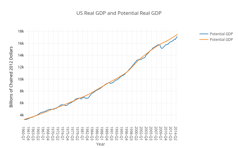
These graph tips show how to use getFredData and plotly to import data into Matlab and then create nice looking plots from it. Start with a simple example illustrating how to import two time series (GDP and Potential GDP) using getFredData. Then draw a basic two line graph using plotly (generates an online version, and saves a pdf copy). The graph will look like. The code creating the plotly graph is actually much more complicated than needed, but since you can largely copy-paste this isn’t a real problem and helps set us up for creating more advanced graphs later on.
The matlab code is as follows:
StartDate=’1960-01-01′;
EndDate=’2014-12-31′;
% Real Gross Domestic Product (Billions of Chained 2009 Dollars, Quarterly, Seasonally Adjusted Annual Rate)
fred_GDP = getFredData(‘GDPC1’, StartDate, EndDate)
% Real Potential Gross Domestic Product (Billions of Chained 2009 Dollars, Quarterly, Not Seasonally Adjusted)
fred_PotentialGDP = getFredData(‘GDPPOT’, StartDate, EndDate)
trace1= struct(‘x’, {cellstr(datestr(fred_GDP.Data(:,1),’yyyy-QQ’))},’y’,fred_GDP.Data(:,2),’name’, ‘Potential GDP’,’type’, ‘scatter’,’marker’,struct(‘size’,1));
trace2= struct(‘x’, {cellstr(datestr(fred_PotentialGDP.Data(:,1),’yyyy-QQ’))},’y’,fred_PotentialGDP.Data(:,2),’name’, ‘Potential GDP’,’type’, ‘scatter’,’marker’,struct(‘size’,1));
data = {trace1,trace2};
layout = struct(‘title’, ‘US Real GDP and Potential Real GDP’,’showlegend’, true,’width’, 800,…
‘xaxis’, struct(‘domain’, [0, 0.9],’title’,’Year’), …
‘yaxis’, struct(‘title’, fred_PotentialGDP.Units(:),’titlefont’, struct(‘color’, ‘black’),’tickfont’, struct(‘color’, ‘black’),’anchor’, ‘free’,’side’, ‘left’,’position’,0) );
response = plotly(data, struct(‘layout’, layout, ‘filename’, ‘PotentialGDP_US’, ‘fileopt’, ‘overwrite’));
response.data=data; response.layout=layout;
saveplotlyfig(response, ‘PotentialGDP_US.pdf’)