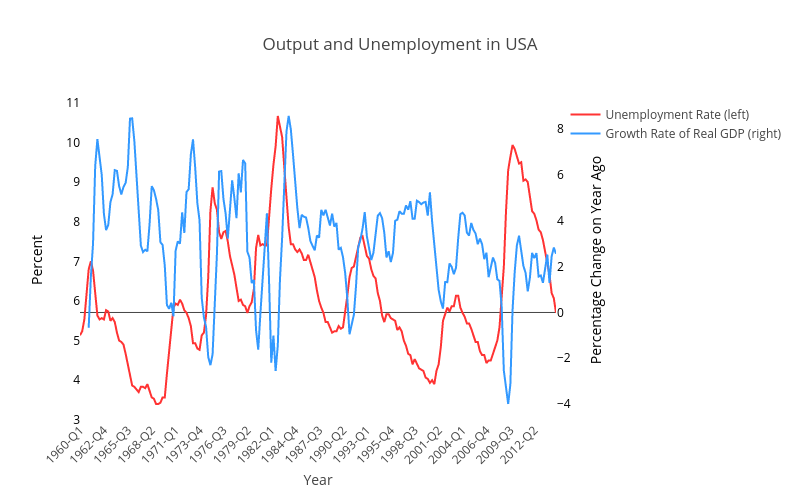
Sometimes you want the growth rate of a series and not the level. getFredData allows you to easily make unit changes such as this when importing data. This example uses getFredData to download US Real GDP measured as percentage change on year ago. It then plots this against unemployment, illustrating how to use two different y-axes. The graph created is shown below. (List of other unit change with getFredData) (Note that for many variables FRED often contains both a variable code for the level and another for growth rates, where this is the case you should give preference to using those versions directly)
Matlab Code (the percentage change on year ago is the ‘pc1’):
% USA
% Unemployment Rate: Aged 15 and Over: All Persons for Spain (Percent, Quarterly, Seasonally Adjusted)
fred_US_Unemp = getFredData(‘LRUNTTTTUSQ156S’, StartDate, EndDate)
% Gross Domestic Product by Expenditure in Constant Prices: Total Gross Domestic Product for Spain (Chained 2000 National Currency Units, Quarterly, Seasonally Adjusted)
fred_US_GDPgrowth = getFredData(‘NAEXKP01USQ652S’, StartDate, EndDate,’pc1′)
% Now draw the graph putting each series on a different y-axis
trace1= struct(‘x’, {cellstr(datestr(fred_US_Unemp.Data(:,1),’yyyy-QQ’))},’y’,fred_US_Unemp.Data(:,2),’name’, ‘Unemployment Rate (left)’,’type’, ‘scatter’,’line’, struct(‘color’, ‘hsv(0,80,100)’));
trace2= struct(‘x’, {cellstr(datestr(fred_US_GDPgrowth.Data(:,1),’yyyy-QQ’))},’y’,fred_US_GDPgrowth.Data(:,2),’name’, ‘Growth Rate of Real GDP (right)’,’type’, ‘scatter’,’yaxis’,’y2′,’line’, struct(‘color’, ‘hsv(210,80,100)’));
data = {trace1,trace2};
layout = struct(‘title’, ‘Output and Unemployment in USA’,’showlegend’, true,’width’, 800,…
‘xaxis’, struct(‘title’,’Year’,’showgrid’,false,’anchor’,’y2′,’tickangle’,-45,’nticks’,20), …
‘yaxis’, struct(‘title’, ‘Percent’,’titlefont’, struct(‘color’, ‘black’),’tickfont’, struct(‘color’, ‘black’),’position’,0,’anchor’, ‘free’,’showgrid’,false),…
‘yaxis2’, struct(‘title’,’Percentage Change on Year Ago’,’titlefont’, struct(‘color’, ‘black’),’tickfont’, struct(‘color’, ‘black’),’overlaying’,’y’,’position’,1,’side’,’right’,’anchor’, ‘free’,’showgrid’,false) );%, …
response = plotly(data, struct(‘layout’, layout, ‘filename’, ‘US_GDPgrowth_Unemp’, ‘fileopt’, ‘overwrite’));
response.data=data; response.layout=layout;
saveplotlyfig(response, ‘./Graphs/US_GDPgrowth_Unemp.pdf’)